

9 great examples of conference website designs

Published on 17 Jan 2024
Get inspired: build an exceptional conference website
A conference website is not just a nice-to-have—it’s your event’s digital cornerstone, a dynamic tool for more than just sharing dates, locations, or speaker bios. It’s the platform where your vision takes shape, addressing critical challenges like:
- Attracting sponsors to fund your vision.
- Building credibility to stand out in a crowded academic space.
- Inspiring participants to attend, especially in a post-pandemic world.
- Driving registrations and submissions with ease.
If you’re thinking, “This sounds great, but I’m not a web designer or marketing expert. I’m already balancing grant writing, reviewing papers, and running a lab,” we hear you. Academic conference organizers often face this exact challenge. But here’s the good news: you don’t need those skills.
With Fourwaves, you can create a professional, fully customizable conference website—no design expertise required. We’ve helped universities and research institutions worldwide build beautiful, user-friendly sites that integrate everything you need, from registration and abstract submission to schedules and virtual tools.
Why a stunning website matters for academic conferences
Let’s face it: many academic conference websites feel outdated, hard to navigate, or visually unappealing. This doesn’t just hurt your event’s image—it can deter registrations and reduce engagement.
An effective, well-designed website sets the tone for your event and communicates professionalism. It convinces potential sponsors, presenters, and attendees that your conference is worth their time and resources.
Imagine this: a conference website built for you
With Fourwaves, you don’t just get a basic website—you get a powerful, customizable platform designed specifically for academic events.
Here’s what makes Fourwaves stand out:
- Simple Setup: Create a polished website in minutes, even if you’re not tech-savvy.
- Comprehensive Tools: Integrate registration, payment processing, abstract management, and event scheduling seamlessly.
- Customizable Design: Add your university or organization’s branding for a professional, cohesive look.
- Mobile-Optimized Experience: Ensure your website looks great on any device, from laptops to smartphones.
Fourwaves conference website
You can try Fourwaves for free so don’t hesitate to give it a go and book a demo to see if it would fit your needs. Without further ado, here are our 9 examples of best event website designs.
9 best conference website designs examples
To help you envision what’s possible, here are 9 exceptional conference website designs—each offering inspiration and ideas for your event.
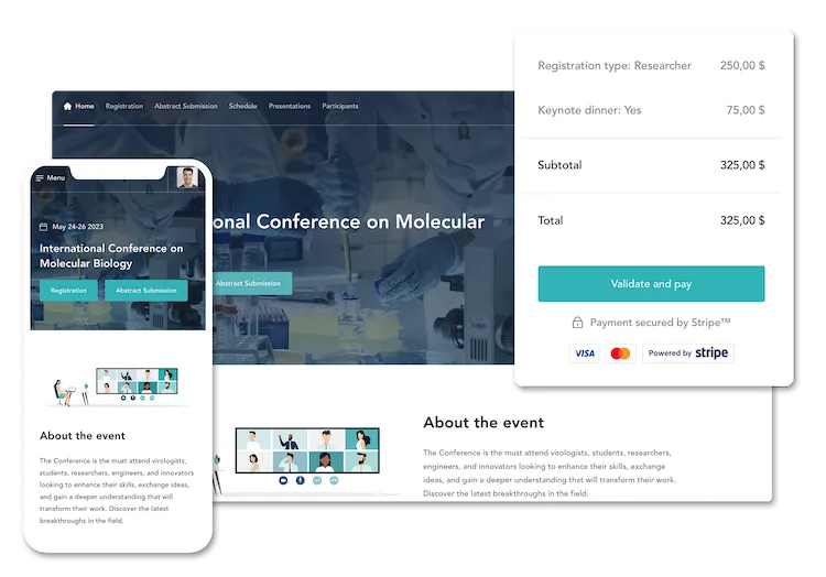
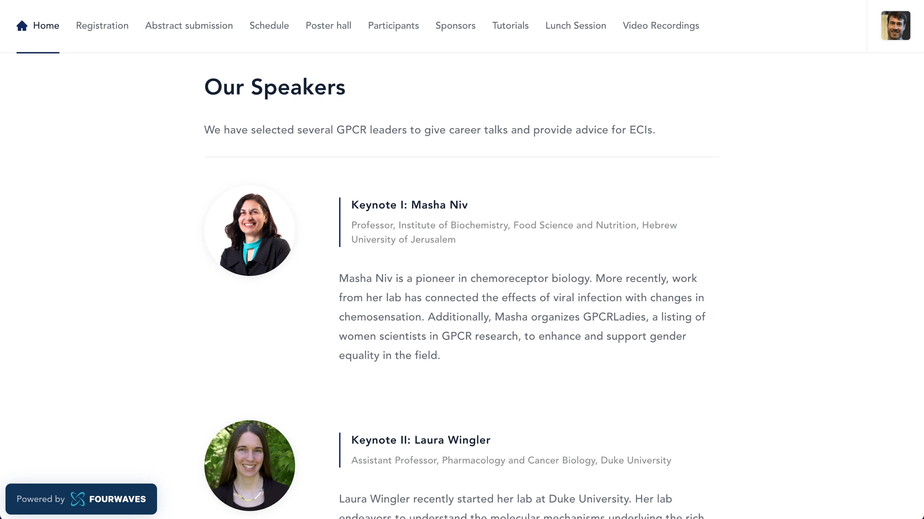
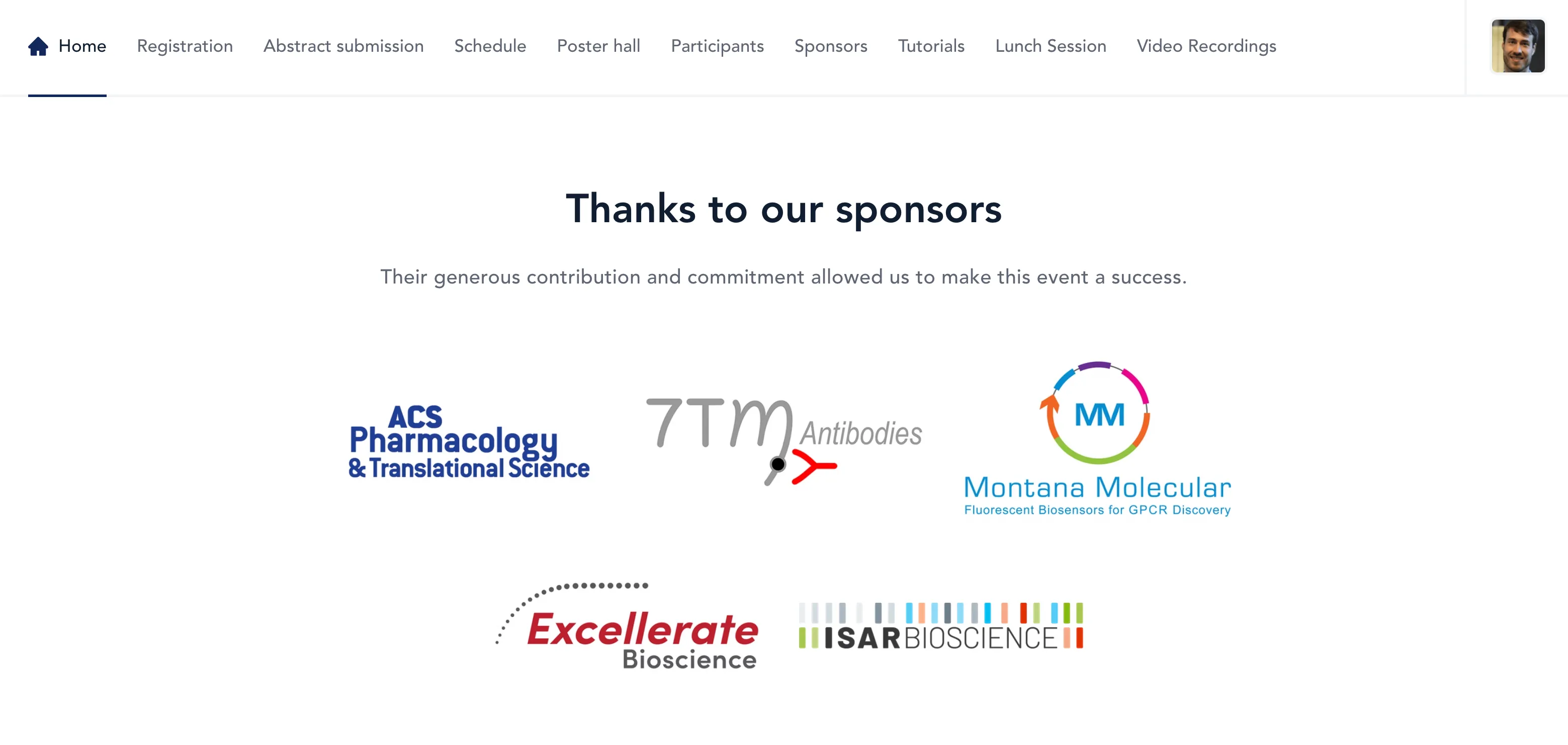
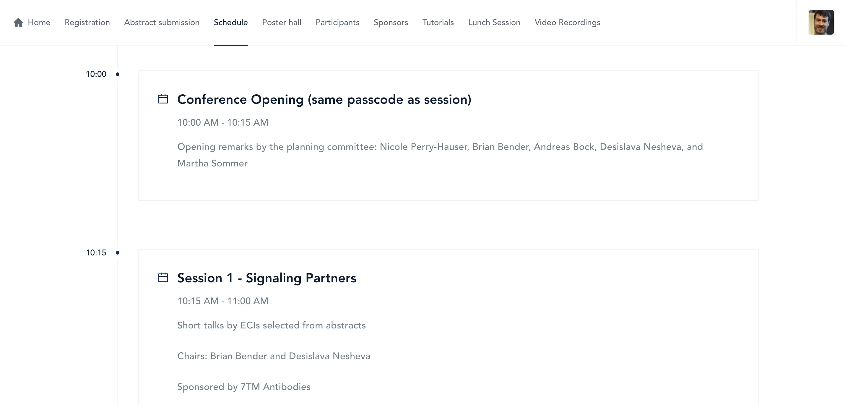
1. Transatlantic ECI GPCR Symposium
This one-day event promotes collaboration and collegiality among early-career scientists in the GPCR research field.
What we love
- A clean, simple structure with key information organized into easily digestible blocks.
- The registration button stands out with a bold color, guiding participants directly to sign up.
- A fully responsive design ensures seamless viewing across devices.
How to apply this to academic and scientific events
- Simplify Navigation: Use sticky menus and clear sections to make it easy for attendees to find vital information.
- Highlight Registration: Ensure the registration or abstract submission button stands out to drive conversions.
- Optimize for Mobile: A mobile-friendly site is essential for today’s on-the-go researchers.
Pro tip
Use Fourwaves to create a responsive, professional site with integrated registration and submission tools to simplify event management.
The contributing sponsors are displayed with colored logos that add a nice visual touch.
The event schedule is also presented with no distractions. The timeline on the left side shows what time each session happens.
Last but not least, the whole website is fully responsive, which means it can be viewed on mobile devices or tablets.
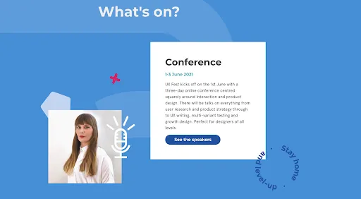
An online celebration of digital design and user experience, featuring talks on research, product strategy, and more.
What we love
- Engaging animations and micro-interactions add a layer of dynamism to the site.
- Captivating transitions make browsing the site enjoyable and interactive.
- Strong focus on the event’s identity through design elements.
How to apply this to academic and scientific events
- Use simple animations to draw attention to key sections, like registration or abstract submissions.
- Avoid overloading with effects—maintain professionalism while adding subtle, engaging visuals.
- Highlight the main event theme visually to set the tone for attendees.
Pro tip
Fourwaves offers customizable templates to help you design visually engaging yet professional websites. Learn more in our Guide to Building Conference Websites.
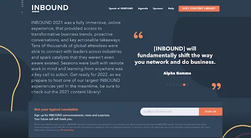
3. Inbound
HubSpot’s annual event on customer relationship management and digital marketing strategies.
What we love
- Consistent branding aligns perfectly with HubSpot’s identity through colors, typography, and layout.
- Engaging video content prominently displayed above the fold.
- Intuitive design creates a strong professional impression.
How to apply this to academic and scientific events
- Incorporate your university or institution’s branding for credibility.
- Use video banners to introduce keynote speakers or highlight the conference theme.
- Keep the design cohesive for a polished, professional look.
Pro tip
Easily integrate branding elements into your conference website using Fourwaves’ customization tools.
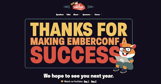
4. Emberconf
A vibrant event for developers focused on Ember.js, an open-source web framework.
What we love
- Bold, retro-style design with vibrant graphics and playful fonts.
- A unique and memorable website layout that stands out.
- Captures the event’s fun and dynamic atmosphere effectively.
How to apply this to academic and scientific events
- Use thematic design elements that reflect your event’s field, such as molecules for chemistry or data visualizations for AI conferences.
- Balance creativity with professionalism to appeal to academic audiences.
Pro tip
Fourwaves allows you to customize colors and layouts to align with your event’s unique identity. Learn more in our Conference Planning Guide.
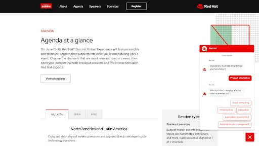
5. Red Hat Summit
Exploring open-source innovation and IT advancements in enterprise settings.
What we love
- Sleek, minimalistic design with clear navigation and polished visuals.
- Professional chatbot integration for attendee support.
- Meticulously designed landing page with well-balanced content.
How to apply this to academic and scientific events
- Use a clean design to convey professionalism and credibility.
- Consider adding a chatbot or FAQ section to address attendee questions efficiently.
- Prioritize intuitive navigation for a smooth user experience.
Pro tip
Streamline communication with attendees using tools like FAQs and email integrations in Fourwaves.
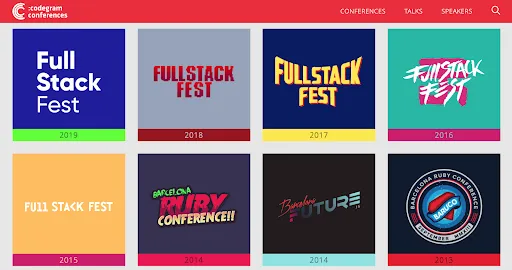
6. Full Stack Fest
A web developer event that archives past editions to showcase its evolution.
What we love
- Demonstrates credibility through detailed archives of past conferences.
- Highlights key metrics, themes, and logos for each year.
- Reinforces relevance by showcasing consistent innovation.
How to apply this to academic and scientific events
- Build credibility by showcasing past conferences, including speaker highlights and participant metrics.
- Use your website as a long-term resource hub for attendees.
- Update themes yearly to reflect your conference’s growth and innovation.
Pro tip
Fourwaves enables easy archival of past events, making it simple to showcase your history and build trust. Explore more in our Event Website Feature.
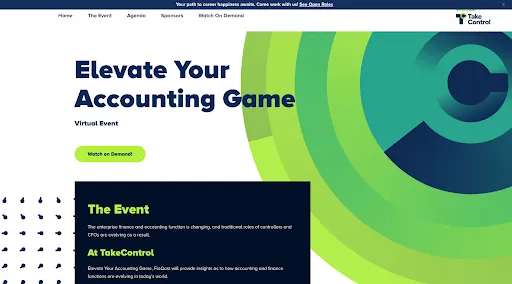
7. Take Control
A finance-focused event exploring automation, accuracy, and collaboration in financial processes.
What we love
- Single-page layout provides a streamlined user experience.
- Sticky top menu ensures seamless navigation.
- Fast-loading content eliminates friction for attendees.
How to apply this to academic and scientific events
- Use a single-page layout to simplify navigation for busy researchers.
- Highlight crucial details like schedules and registration in prominent sections.
Pro tip
Save time and create a polished single-page layout using Fourwaves’ templates.
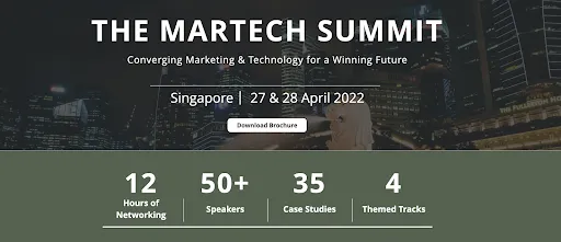
8. The Martech Summit
A marketing and technology conference emphasizing networking opportunities.
What we love
- Networking opportunities are prominently highlighted with metrics and testimonials.
- Speaker profiles emphasize their affiliations with top-tier organizations.
- Design communicates the event’s differentiators effectively.
How to apply this to academic and scientific events
- Highlight your event’s networking sessions or unique value proposition prominently.
- Use speaker affiliations to build credibility and attract attendees.
Pro tip
Fourwaves makes it easy to emphasize networking opportunities and speaker highlights in a professional format. Learn more here.
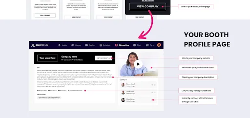
9. AdWorld Conference
A global virtual event on advertising trends and innovations.
What we love
- Communicates exhibitor benefits with clear visuals and interface previews.
- Vibrant color coding makes navigation intuitive and engaging.
- Cosmic-themed speaker profiles add personality and excitement.
How to apply this to academic and scientific events
- Use visuals to communicate sponsor benefits clearly.
- Incorporate vibrant colors to differentiate tracks or sessions.
- Add creative speaker profiles to make your event memorable.
Pro tip
Showcase sponsor benefits effectively using Fourwaves’ tools for sponsor sections and branding.
The success of your conference begins with one critical question: What are the objectives of your event? Every decision you make—whether it’s social media strategy, abstract deadlines, or your conference website design—should align with achieving these goals.
A well-crafted conference website serves as the cornerstone of your event. It’s your tool to:
- Share essential information like registration and submission deadlines.
- Facilitate seamless communication between organizers and participants.
- Provide travel details for in-person events.
- Showcase sponsor contributions and attract future partnerships.
- Share detailed schedules, abstracts, and session details.
- Extend the event’s impact with post-event materials like recordings and testimonials.
But let’s face it: academic conference websites are often outdated and hard to navigate. In today’s digital world, that simply won’t cut it anymore. Whether your event is in-person, virtual, or hybrid, attendees expect a professional, user-friendly, and visually appealing platform.
That’s where Fourwaves comes in. With modern website templates and intuitive tools designed specifically for academic events, Fourwaves empowers you to:
- Effortlessly create a polished, fully customizable website—no design expertise needed.
- Integrate everything from registrations and payments to abstract submissions and schedules.
- Elevate the experience for both organizers and attendees with mobile optimization and virtual features.
Event planning doesn’t have to be overwhelming. With the right tools, you can save time, reduce stress, and focus on what truly matters: delivering an engaging, impactful event.
So why wait? Try Fourwaves for free, book a demo today to see how easy it is to bring your event vision to life. Let’s transform your conference website into a platform that inspires, engages, and drives results.